
 I have been doing a fair amount of work on creating a template for the Hydrographic Academy for both presentations and also for content creation in PowerPoint 2010. The latter would be used within the Mohive interface I have discussed in earlier posts. I felt it very important that the
Hydrographic Academy identity is carried throughout and provided in a professional manner. The main structure is black or white backgrounds, simple clean lines and a sans serif text to suit the Disability acts. I went for the HA blue, as we are now calling it, for the text colour (when used on a black background) and plain black text on white as an alternative. Black backgrounds lend themselves well to excellent contrast; generally are used in video productions; are predominately easier to read in low lit conditions; and on certain devices use up less battery power on back lighting (so to speak).
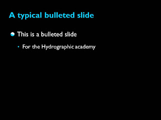
Bullets were designed with the white and blue from the logo in mind.
Why the simplicity? This is a personal view, but I often feel that PowerPoint templates have a tendency to age rapidly. Going for simple fonts and lines are less likely to age and it gives it as more established and classic look. I also think this looks much more professional to the end users.
Transitions are basic wipes (nothing to tacky please...) and a rather nice water ripple effects for starting screens. We are in discussions on whether to add the HA logos in certain parts of the slides, but no decisions as yet. Undoubtedly this is not the very last version (as I'm always in talks with our content developers experiences of using the template), but I thought this closely resembles the most likely version for the future. I'm atticipating this will feature in many a presentation before any content is released in Mohive, at least it's a taster of what is to come...
No comments:
Post a Comment